
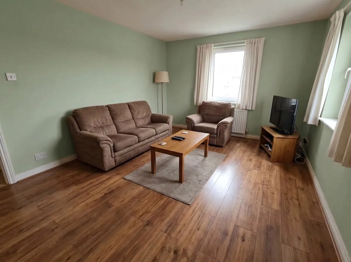
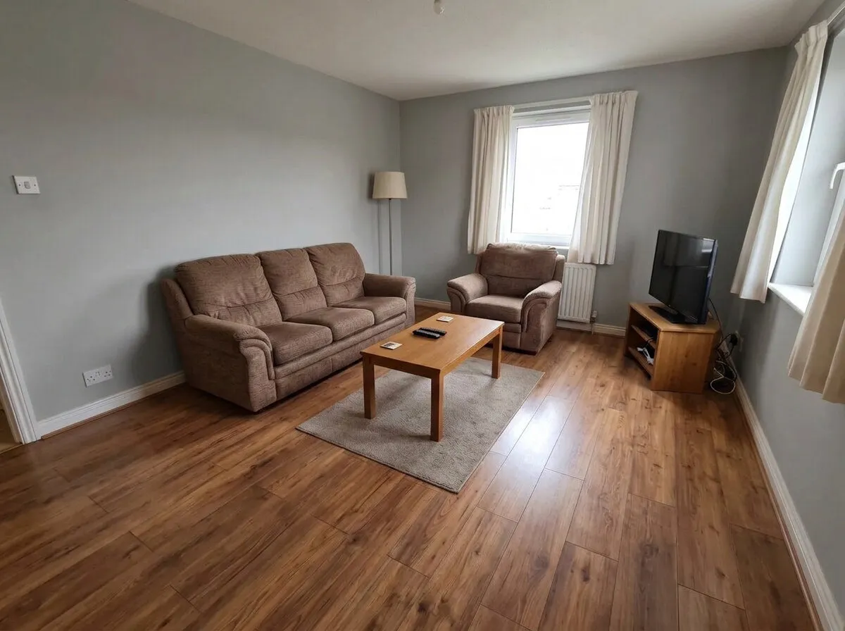
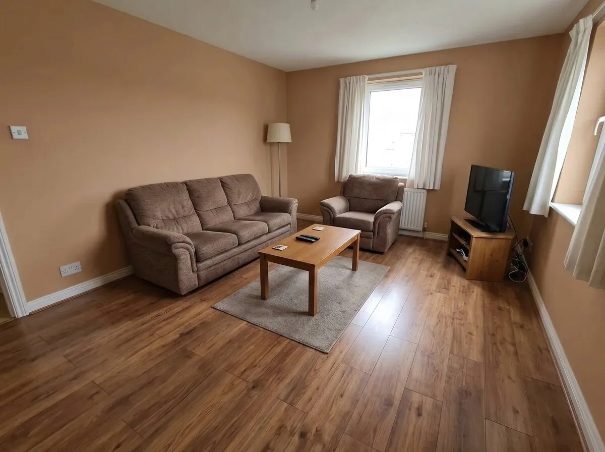
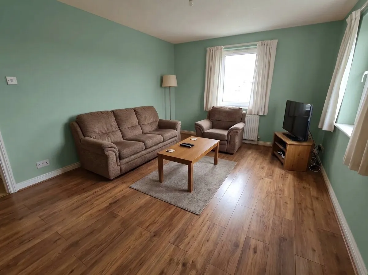
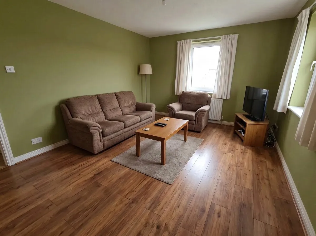
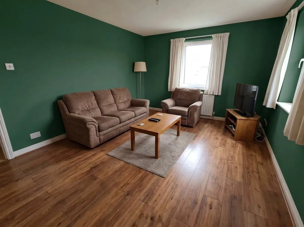
Sage green (#B5C4A6): a soft gray-green. Brown and green are an easy pair, like wood and leaves, and the room stays light.
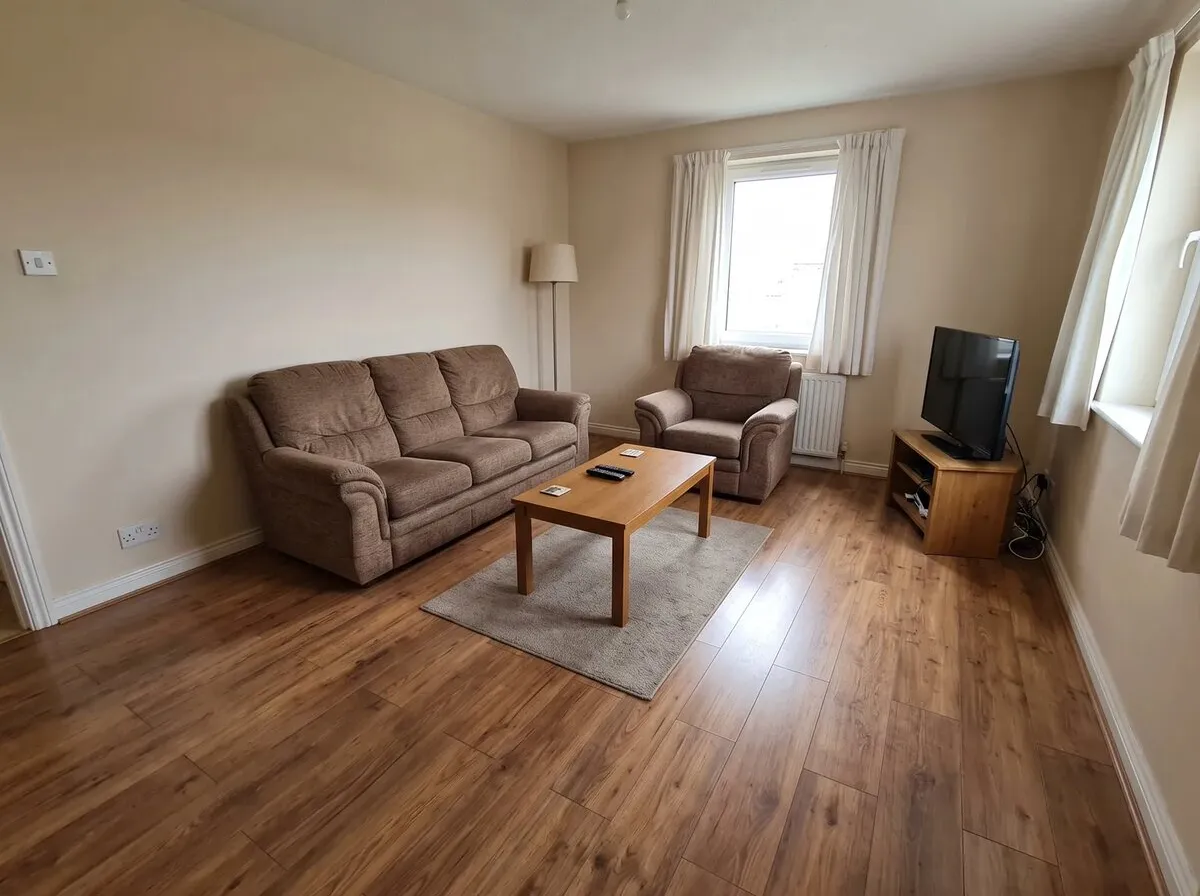
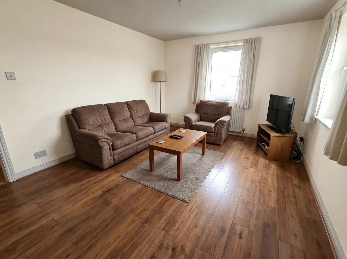
Off-white (#F3EFE6): a shade lighter and less yellow than the cream it replaces. The room looks brighter, and the sofa and floor look darker against it.
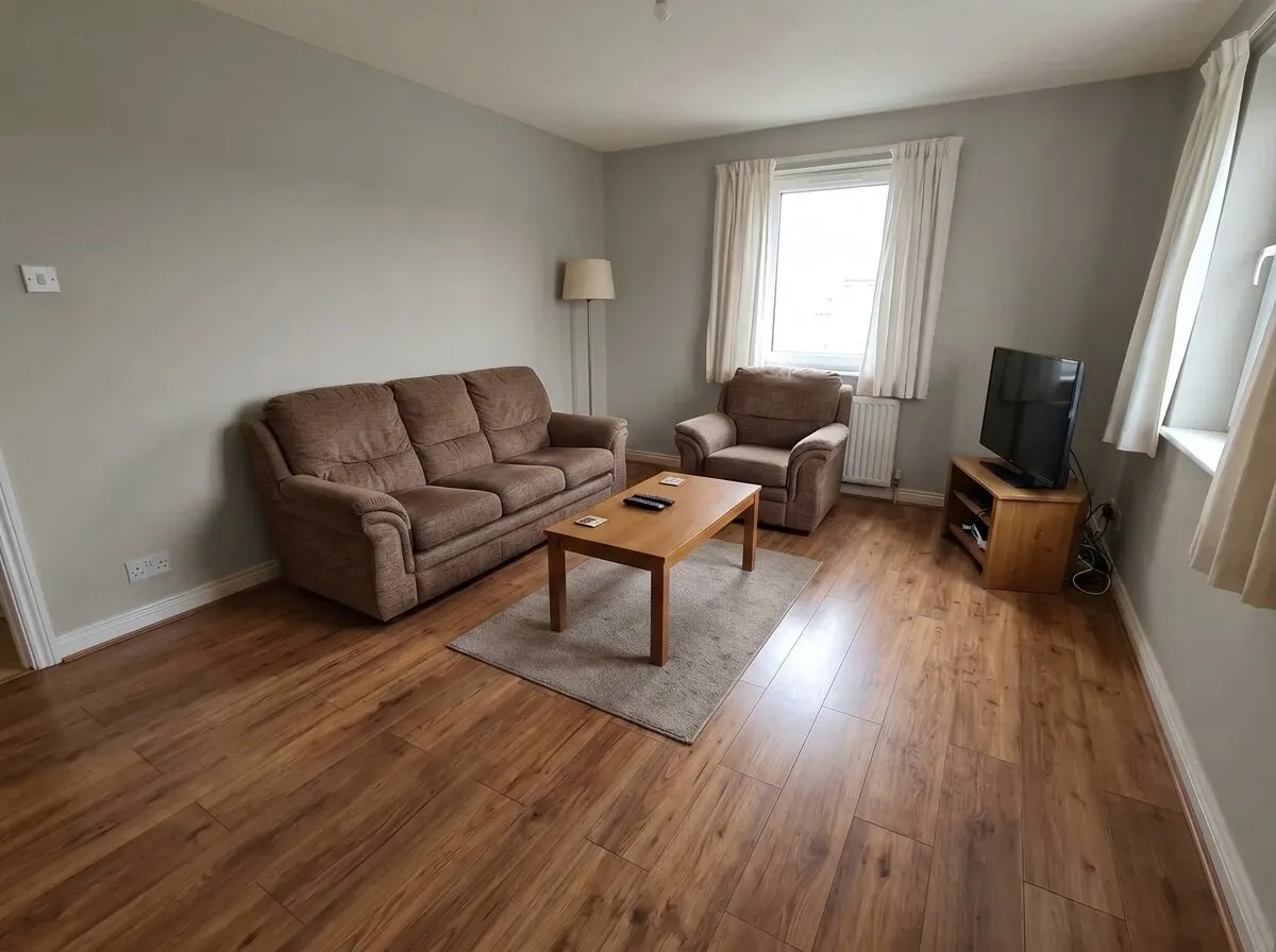
Stone gray (#BDB8AE): a light gray with some warmth in it. It sits quietly behind the brown sofa and the wood floor.
Dove gray (#9C9A97): a mid gray with little warmth. Next to the brown sofa and the orange-toned floor it reads cool.
Clay (#B08B6E): a warm tan. The walls, sofa and floor end up in one family of browns: calm, with little contrast.
Eucalyptus (#8FA79A): a cooler, bluer green than sage. Fresh beside the cream curtains, cooler against the warm floor.
Olive (#7D8150): a yellow-green with weight. It leans toward the sofa and the wood, so the whole room turns earthy.
Forest green (#2F5240): dark and saturated. The white trim, the ceiling and the curtains stand out, and the room feels closer.
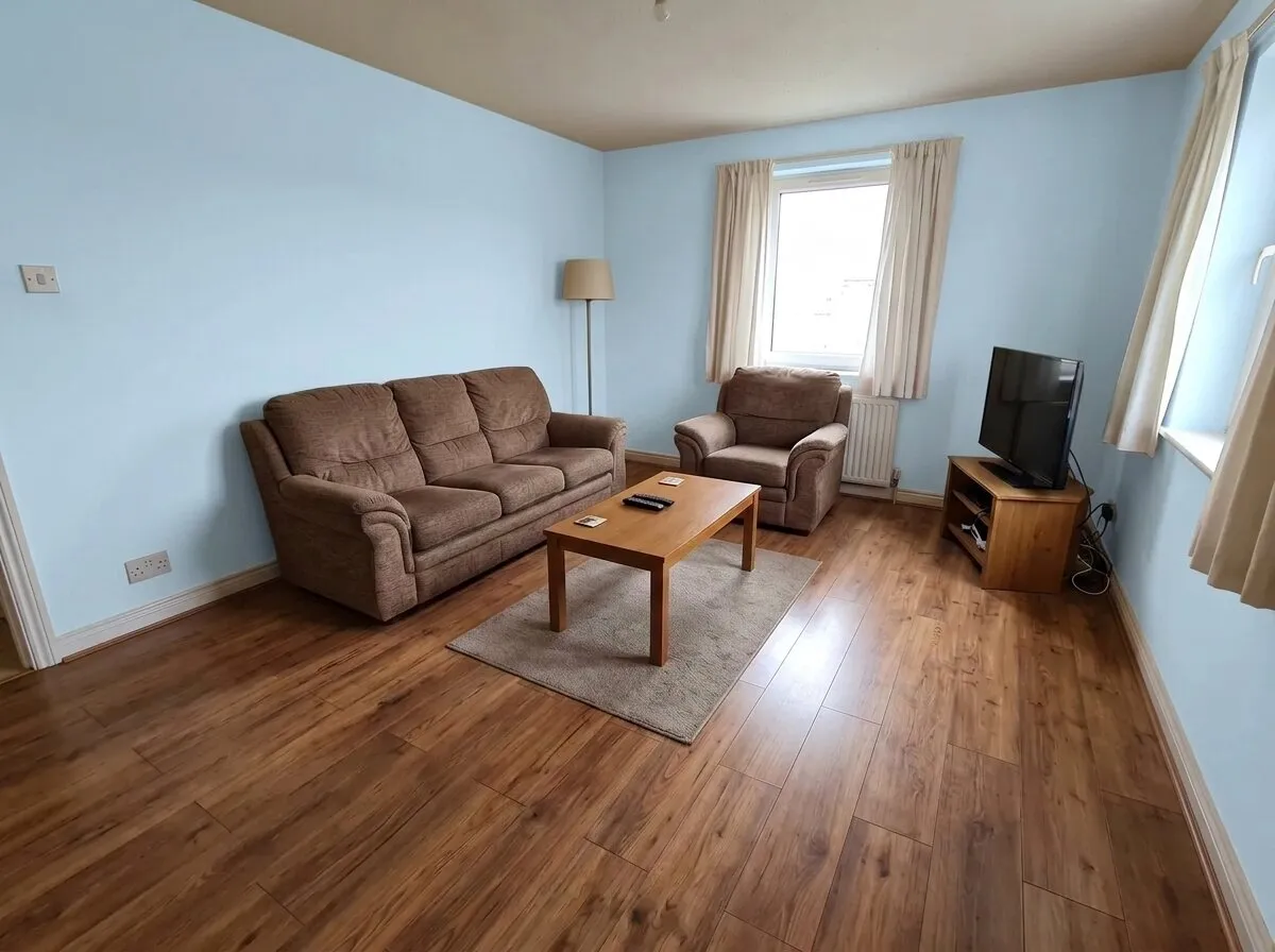
Sky blue (#BFD8E8): pale and airy. Blue sits opposite orange on the color wheel, so the wood floor looks richer.
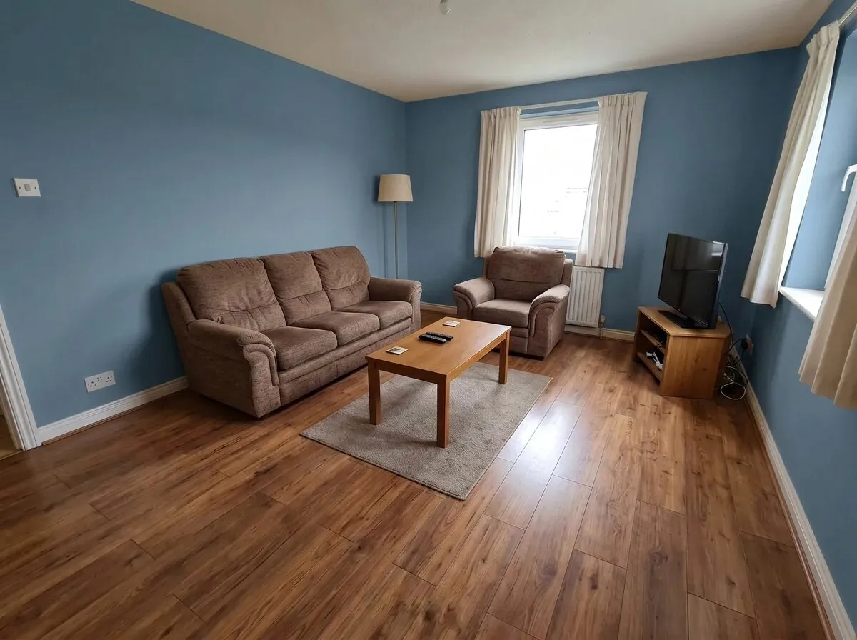
Storm blue (#5E7A8C): a mid blue with gray in it. Clearly a color, still calm, and the brown sofa looks warmer against it.
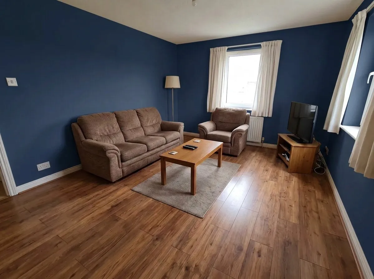
Navy (#22334F): the darkest blue here. An old pairing with brown furniture and white trim; it asks for good light.
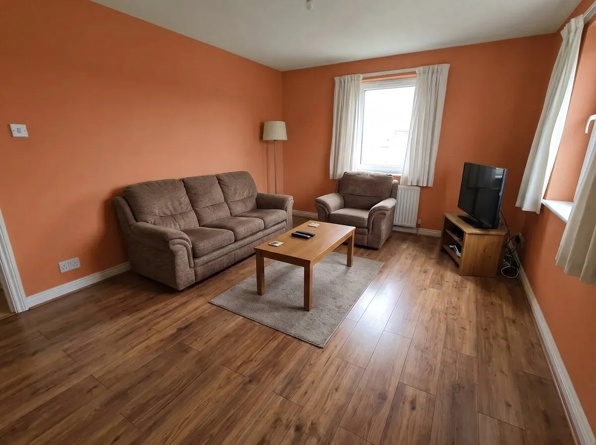
Terracotta (#C9714C): a burnt orange. Close in tone to the wood floor, so the walls, floor and sofa all turn warm at once.
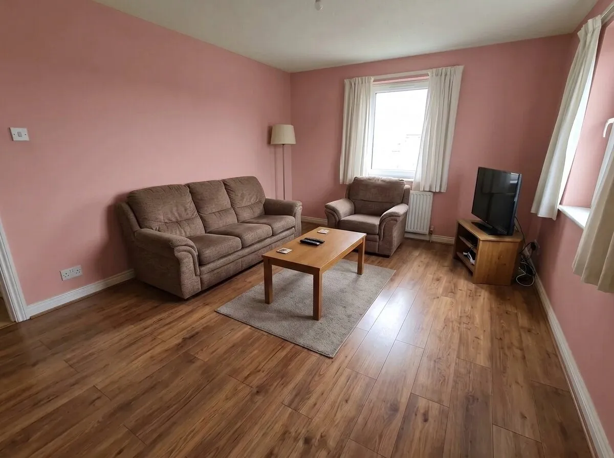
Dusty rose (#C99A9A): a muted pink. Softer than it sounds beside brown, and warm in gray daylight.
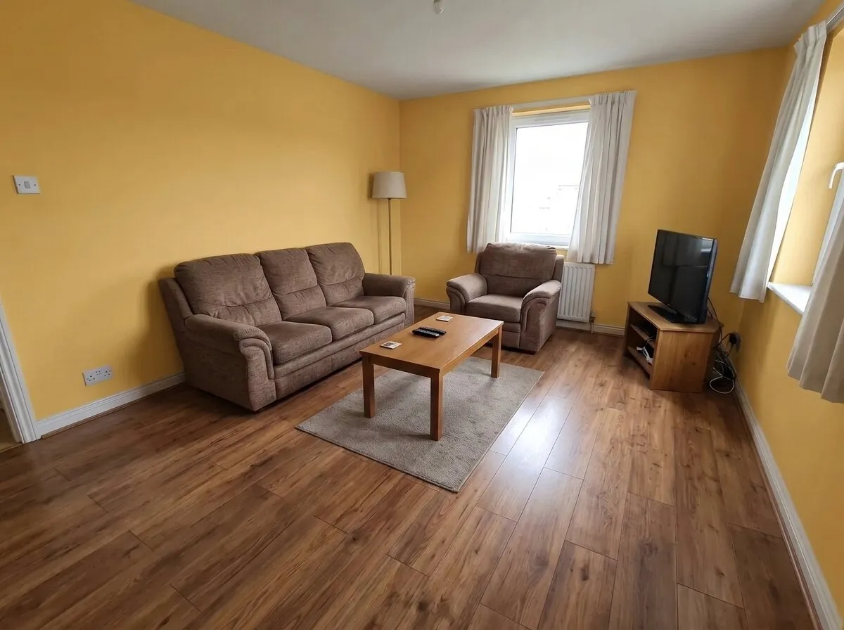
Honey (#E3B867): a golden yellow. The sunniest wall of the fifteen, and the one that changes the room’s mood the most.
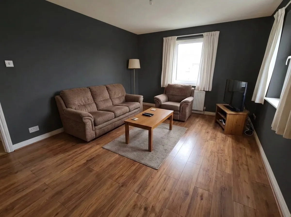
Charcoal (#2B2C2E): nearly black. The brown sofa looks lighter by contrast, and the white trim draws a line around the room.
Before: an AI-generated sample room from the app. After: the result from roomvia.
The short answer
- Not sure? Off-white or a light warm gray. Both suit almost any couch and floor, and both keep the room bright.
- Want color without a big risk? Sage green or storm blue. Each has gray in it, so it reads calm, not loud.
- Want a dark room? Navy, forest green or charcoal. They need good daylight, and they look sharpest with white trim.
- Want warmth? Clay, terracotta, honey or dusty rose. They sit well with warm wood, but many warm surfaces together can feel heavy.
- Before you buy paint, look at the color on your own walls, in your own light. The last sections show how.
| Color | Lightness | In this room |
|---|---|---|
| Off-white | 87 | Brighter and cleaner than the cream it replaced |
| Stone gray | 48 | Quiet; the couch and floor lead |
| Dove gray | 32 | Cool next to the warm wood |
| Clay | 29 | Browns on browns: calm, little contrast |
| Sage green | 52 | Soft and natural with brown |
| Eucalyptus | 36 | Fresher and cooler than sage |
| Olive | 21 | Earthy; pulls the room warm |
| Forest green | 7 | Dark and rich; the white trim stands out |
| Sky blue | 66 | Airy; the wood floor looks richer |
| Storm blue | 18 | Calm, and clearly a color |
| Navy | 3 | An old pairing with brown; asks for light |
| Terracotta | 25 | Warm walls on a warm floor |
| Dusty rose | 38 | Softer than it sounds |
| Honey | 52 | The sunniest, and the biggest change of mood |
| Charcoal | 3 | Strong contrast; the couch looks lighter |
Lightness is our estimate of how much light a color reflects, from 0 (black) to 100 (white), worked out from its hex value. Each color’s hex value is in its caption, under the picture. Paint makers print a measured figure, the light reflectance value (LRV), on their color chips. Use theirs when you shop.
The room we used
One room, one photo: the Living room sample from the roomvia app. It is an AI-generated picture of an ordinary living room, made to look like a phone photo.
These things are the same in every picture:
- a brown fabric couch (sofa) and armchair;
- a warm, orange-toned wood floor and an oak coffee table;
- cream curtains, white skirting boards and a white ceiling;
- flat, gray daylight from two windows.
The walls start out cream. For each picture we ran the Walls tool on that photo with one paint color in the Eggshell finish. We then checked every result against the original: the camera had not moved, and the couch, floor, curtains and ceiling measured the same. We made two tries per color and kept one. Two tries were dropped: one put a sheet of paper on the coffee table, and one left a shiny patch on a wall.
The color names and hex values are the app’s own. They are not a paint maker’s names.
What the same room shows
Three things show up when the room holds still.
Light walls change the room least. Dark walls change it most. Off-white, stone gray and sky blue leave the room much as it was. Navy, forest green and charcoal make it a different room. The white skirting, the ceiling and the curtains become the brightest things in it.
The wall changes how the couch looks. The couch is the same in every picture. It looks darker against off-white, warmer against the blues, and it blends in next to clay and terracotta. If you like your couch, pick a wall that contrasts with it. If you want it to step back, pick a wall close to it.
One paint is several colors on the wall. In each picture, the wall the daylight falls on is lighter than the wall around the window, and both carry the same paint. Real walls do the same. This is why one small swatch tells you little.
Neutral living room paint colors: whites, grays and tans
Off-white reflects the most light of the fifteen, so it suits a small or dim living room. With a brown couch and a warm floor, an off-white with some warmth in it sits better than a blue-white.
Stone gray is a gray with warmth in it, the kind often called greige. It is the quietest wall here. The couch and the floor carry the room.
Dove gray is cooler. Beside brown fabric and orange-toned wood it reads cold. It suits gray, black or blue furniture and paler floors.
Clay puts the walls, the couch and the floor in one family of browns. That is calm, but it is low on contrast. Light curtains and a pale rug keep it from going flat.
Green living room paint colors
Green and brown sit together easily, like leaves and wood. That makes green a low-risk color for a room with a brown couch or a wood floor.
- Sage green is the gentlest: light, and grayed. The room stays bright.
- Eucalyptus has more blue in it. It looks fresher, and cooler against the warm floor.
- Olive has more yellow in it. It leans toward the couch and the wood, so the room turns earthy.
- Forest green is dark. It needs good daylight, and it relies on the white trim and ceiling for contrast.
Check the undertone before you choose. A yellow-green warms a room. A blue-green cools it.
Blue living room paint colors
Blue sits opposite orange on the color wheel, and brown is a dark orange. So a blue wall makes brown fabric and orange-toned wood look richer. You can see it in all three blues.
- Sky blue is pale and airy. In a room with cool light, a pale blue can turn cold.
- Storm blue is a mid blue with gray in it. It is clearly a color, and it is still calm.
- Navy is the darkest blue here. Navy with brown furniture and white trim is an old pairing. Plan for lamps in the evening.
Warm living room colors
Terracotta is close in tone to the wood floor. Walls, floor and couch all turn warm at once. That can feel snug or heavy, depending on how much daylight the room gets. The gray rug and the white trim give the eye a rest.
Dusty rose is a muted pink. Next to brown it works much like a warm neutral.
Honey is the sunniest wall here. Yellow is strong on four walls. If you like it but aren’t sure, paint one wall first.
Dark living room paint colors
Navy, forest green and charcoal reflect very little light. In daylight they look rich. In the evening they need lamps.
In these pictures the ceiling and the skirting stay white. That contrast keeps the dark rooms crisp. Notice the TV too: a black screen stands out on a pale wall and nearly disappears against charcoal or navy.
If you aren’t sure about a dark color, try it on one wall, such as the wall behind the couch.
Match the wall to your couch and floor
Decide what you are keeping first: the couch, the floor, a large rug, the curtains. Choose the wall last. Paint is the easiest of these to change.
A brown couch, as in this room:
- For contrast: sky blue, storm blue, navy, sage green or forest green.
- To blend: clay, olive or terracotta.
- Safe: off-white or stone gray.
- Take care with cool grays. Dove gray read cold beside this couch and floor.
A gray couch is cooler than this brown one, and this page has no picture of one. As a starting point, warm whites and warm grays keep a gray couch soft. Greens, navy and muted pinks add color. A wall in the same gray as the couch tends to look flat.
Wood floors. An orange or red-toned floor, like this one, is balanced by blues and greens and made stronger by warm walls. A pale or gray floor can take a warmer wall.
Check your light before you choose
The direction your windows face changes every color.
- North-facing rooms get cool, even light, so colors look cooler there. Warm neutrals and colors with warm undertones suit them, and lighter colors help.
- South-facing rooms get warm light for most of the day. Most colors work there, and cooler colors such as greens and blues balance the warmth.
- East-facing rooms get warm light in the morning and cooler light toward the evening. West-facing rooms are the reverse.
These directions are for the northern half of the world. South of the equator, swap north and south.
A color’s light reflectance value (LRV) tells you how light or dark it will look. The scale runs from 0, which reflects no light, to 100, which reflects all of it. The Lightness column in the table above is our estimate of the same thing.
The sample room has flat, gray daylight. In a sunny room, the same colors would look warmer.
Pick a finish
The finish is how shiny the paint is. A flatter finish, such as matte, hides marks and bumps in a wall, but it is harder to wipe clean. A shinier finish, such as satin or gloss, is easier to wipe, and it shows flaws more. Eggshell sits between the two, which makes it a common choice for living room walls.
Every picture on this page uses Eggshell. The Walls tool has four finishes: Matte, Eggshell, Satin and Gloss.
Try a color on your own walls
- Take one photo of your living room in daylight. Stand in a corner, hold the phone level, and get as much wall in the frame as you can.
- In roomvia, open the Walls tool and choose your photo. To see how it works first, pick the app’s Living room sample. It is the room on this page.
- Pick a color and a finish. The tool has 30 paint colors, four finishes and 13 wallpapers.
- Compare before and after with the slider. Then try the next color on the same photo.
- Keep two or three favorites, and move on to real paint.
The Walls tool is built to change only the walls. It can still miss, so check that your furniture, floor and windows look the same in the result. Two tries on the same photo give two slightly different results.
A cluttered photo makes a color harder to judge. Tidy the room first, or clear the clutter from the photo. Painting also means moving the furniture off the walls. That is a good moment to try a new layout in the same photo.
If you are still choosing an app, how to choose an AI interior design app lists what to check.
What a picture can’t tell you
- A screen is not a wall. Screens show color differently, and these pictures are AI images, not measurements. Use them to choose a family and a depth of color, not an exact shade.
- Names are not standard. “Sage green” is a different color at every paint maker. Choose from chips and samples by eye, not by name.
- Light keeps changing. Paint a large sample, or a sample board you can move. Look at it in the morning, at midday and in the evening, in daylight and with the lamps on.
- The finish matters. The same color looks different in a matte finish and in a glossy one.
Questions
What color should I paint my living room?
Start with what you are keeping: the couch, the floor, the curtains. Then look at your light. In a dim or north-facing room, lean light and warm. In a bright room, you can go darker or cooler. Make a short list of three colors, see them on a photo of your own room, and test real samples of the one or two you like most.
What colors make a living room look bigger?
Light colors reflect more light, so the room feels more open. From this set, those are off-white, sky blue and sage green. Keep the ceiling and the trim light too. Dark colors do the opposite: the room feels closer, which some people want.
What color walls go with a brown couch?
In this room, the blues and greens gave the clearest contrast with the brown couch: sky blue, storm blue, navy, sage green and forest green. Off-white and stone gray are the safe choices. Clay, olive and terracotta blend with the couch. A cool mid gray read cold beside it.
Which paint finish suits a living room?
Eggshell or satin suits most living rooms. A flatter finish hides marks in the wall better. A shinier one is easier to wipe.
Can I see a paint color on my walls before I buy it?
Yes, in two ways. A sample pot shows the real paint on a small area. A picture of the whole room, made from your own photo, shows the color everywhere at once. Use the picture to narrow your list and the sample to decide.
Are the pictures on this page real photos?
No. The room is an AI-generated sample photo from the roomvia app, and each colored version is a result from the app’s Walls tool. They show what the tool does. They are not photographs of paint.